5 Ways to Prep Your Home for Listing

If you’re getting ready to sell your home, you might be wondering, “What can I do to help my home appeal to potential buyers?” Maybe you’re even thinking about completely overhauling an outdated bathroom or a retro kitchen. Great news: you don’t have to renovate your entire house to make it more desirable. A few simple updates and a bit of preparation can help any home stand out in a competitive market.
Clean
It can be hard for potential buyers to see past dirt and grime. Give your house a good deep clean before putting it on the market. Be sure to focus on areas of the house that might not always get a lot of attention during regular cleaning, such as:
- Bathroom grout and tile. If your grout is light gray when it’s supposed to be white, it’s probably in need of a deep clean. Bathrooms are important for most buyers, so giving your grout a good scrub to restore it to its former glory can go a long way.
- Floors and carpets. Maybe your floors have seen better days, but you might not have to go as far as tearing up the carpets or laying new floors. Rent a carpet cleaner or hire someone to deep clean your floors for you, and it’ll make a world of difference.
- Windows and other details. Take the time to clean not only your window glass, but the sills and the rails and the casing, too. This might seem like a detail most buyers would overlook, but it goes a long way toward making a house feel fresh and new. Keep other small, detailed areas in mind, too, like baseboards, radiators, vents – anything that might have been collecting dust for a while.
Repair
Are there old nail holes on your walls that you’ve become blind to overtime? Do you have a cabinet door that doesn’t hang quite right, or a cracked tile that needs to be replaced? Before you list your home, take care of all those little fixes and projects you’ve been putting off for ages. Especially when it comes to walls, it won’t take you long to spackle and sand before moving on to the next step on our list.
Paint
A coat of paint can make all the difference, especially if the paint colors you chose for your walls aren’t necessarily to everyone’s taste. Before you put your home on the market, give the interior a fresh coat of paint. Choose softer, more neutral colors that can appeal to anyone. You want potential buyers to be able to picture themselves in the space, and they might struggle imagining themselves relaxing in a home with bright orange or green walls.
Unless the exterior of your house is really worn down, you probably don’t need to worry about painting it. Give it a good pressure wash, and if you think it needs refreshing, try painting just the front door to draw the eye and add some curb appeal.
Update
You don’t need to remodel your entire house before you sell it, but there are a few key updates you can make to add significant value and appeal to buyers:



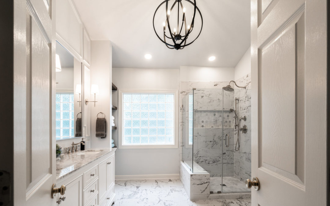
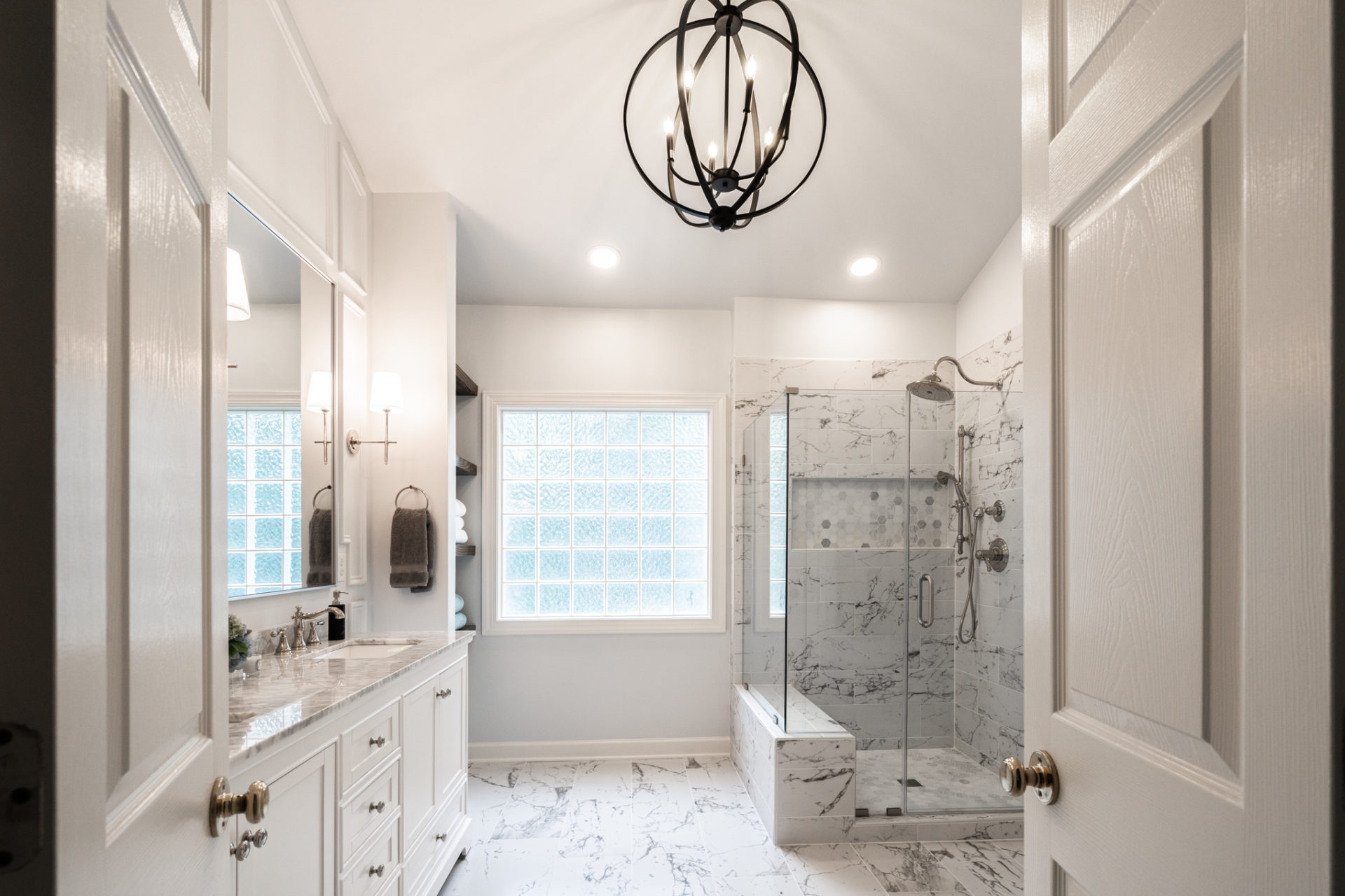
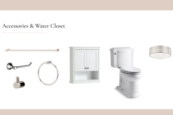
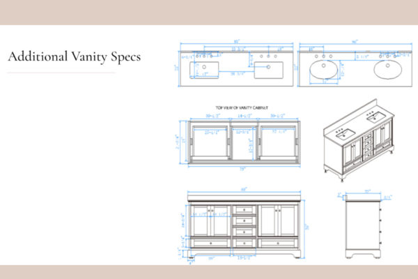
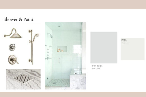
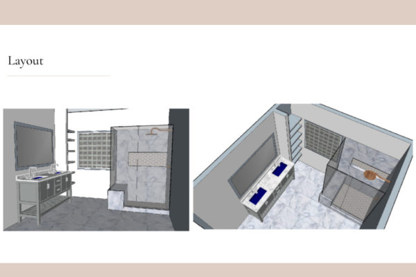
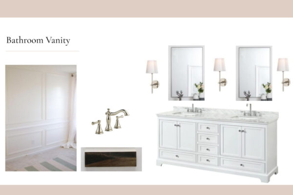
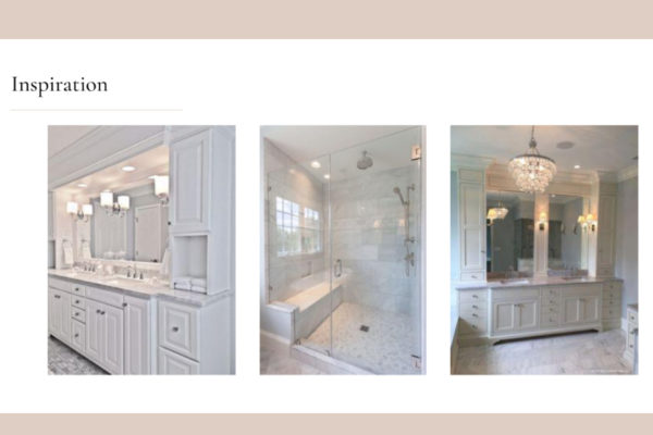
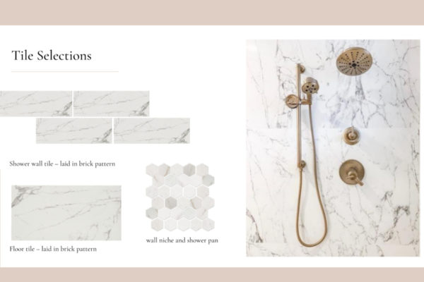
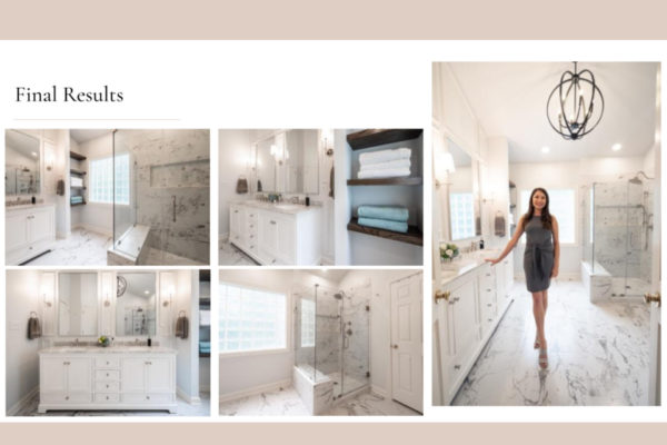
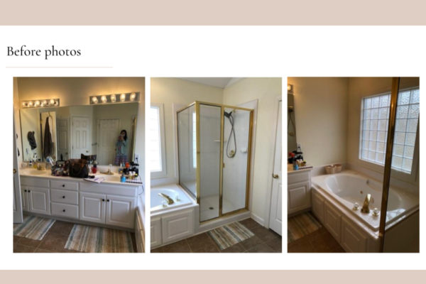
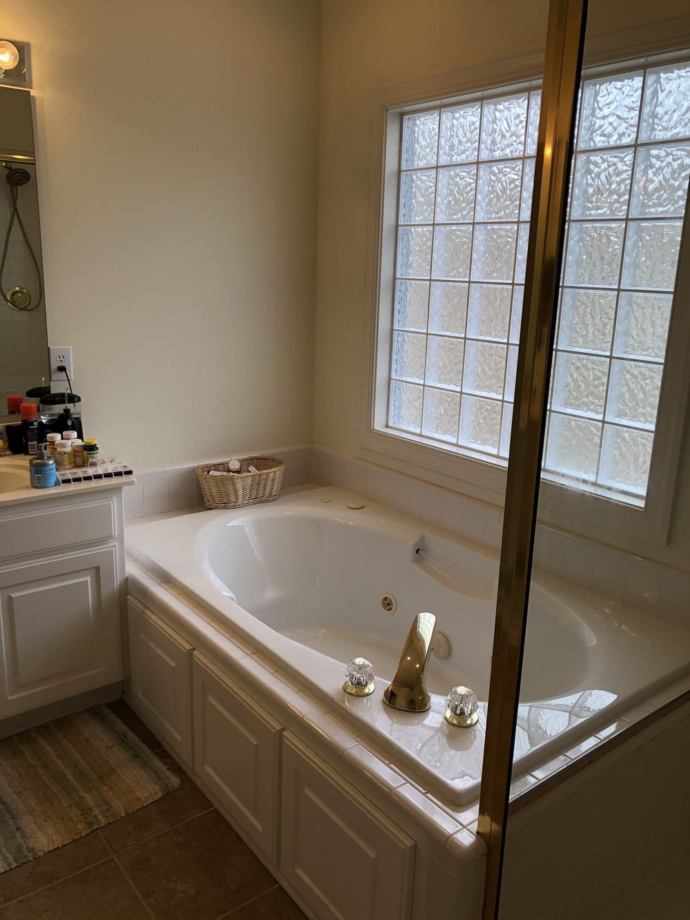
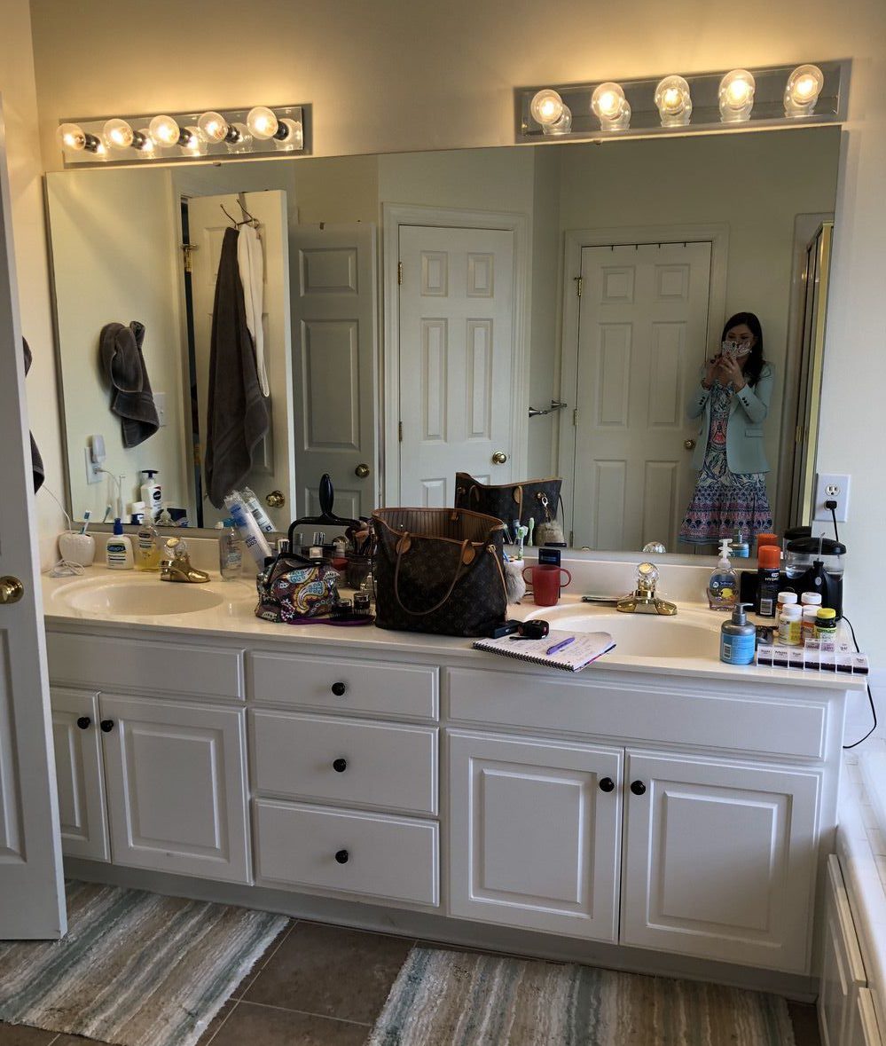
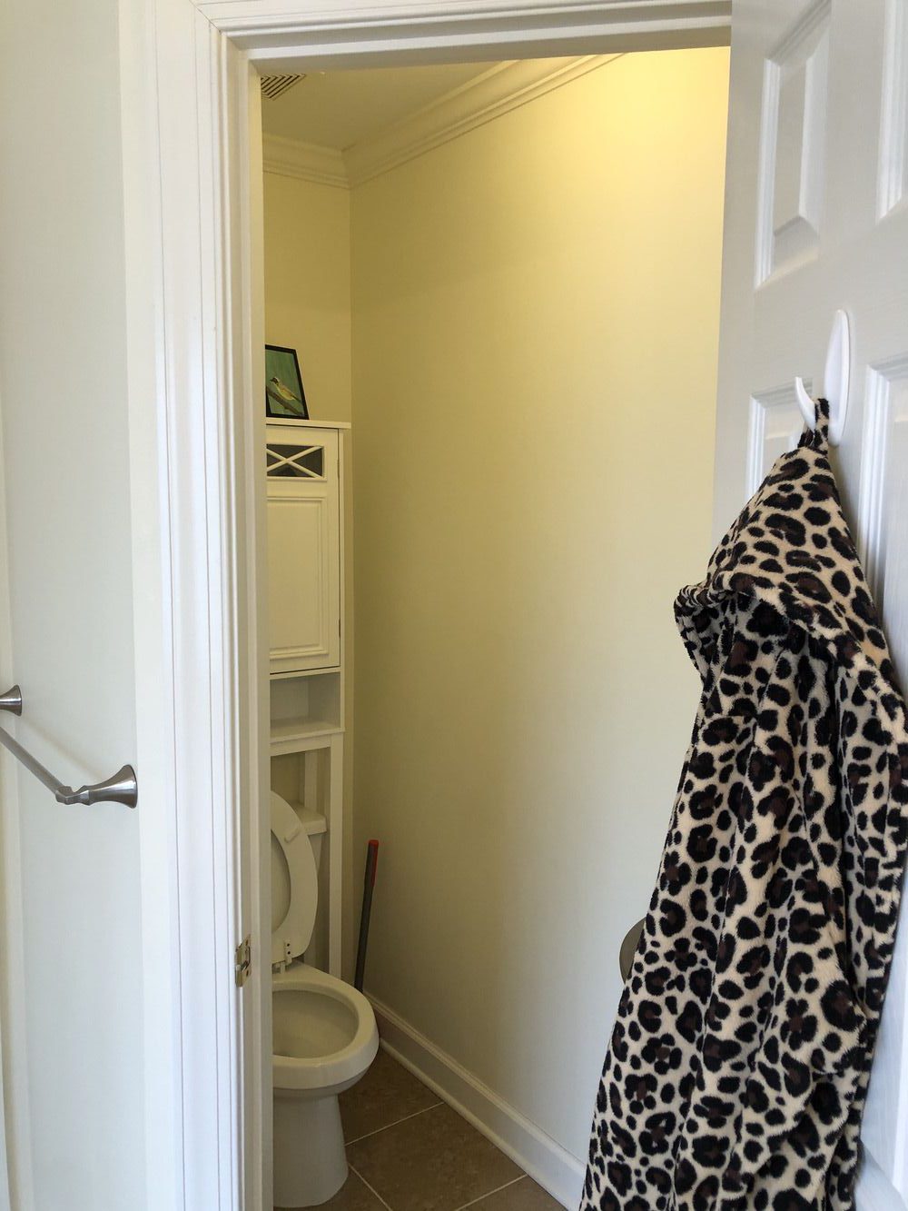
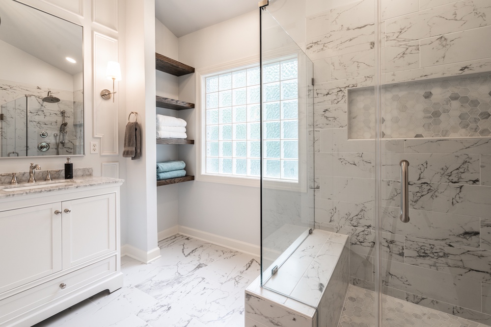
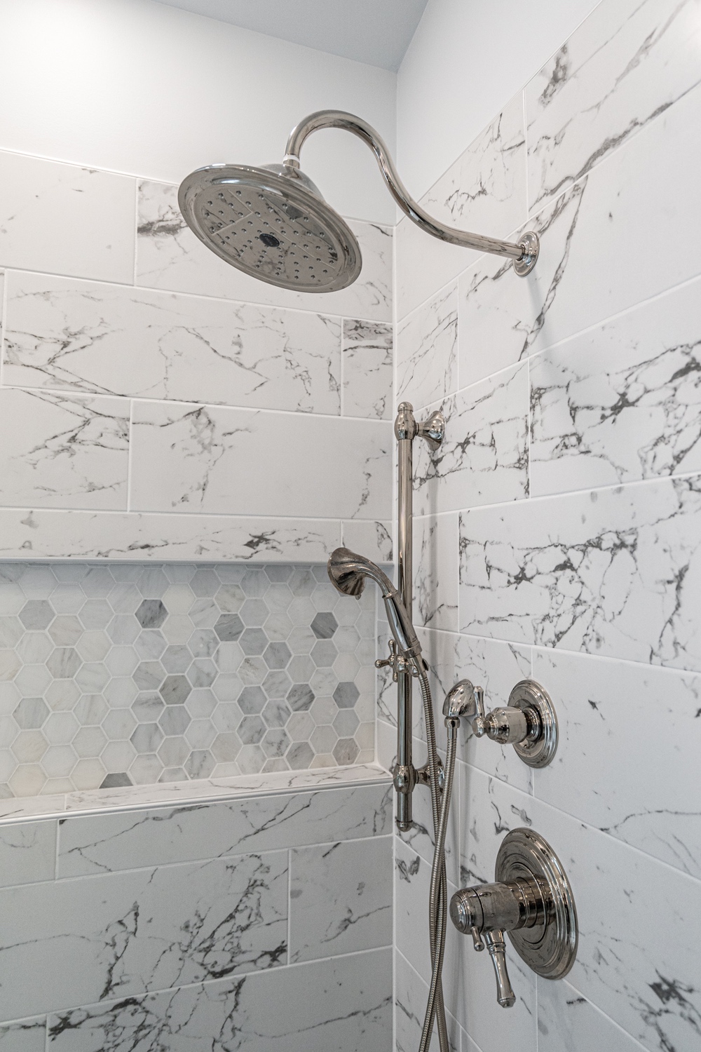
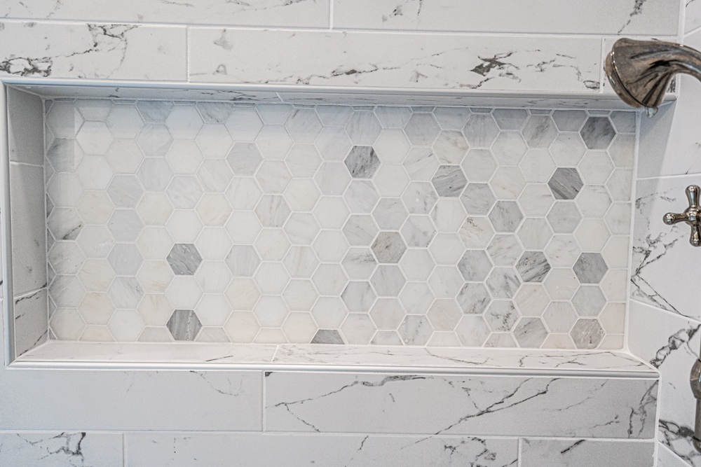
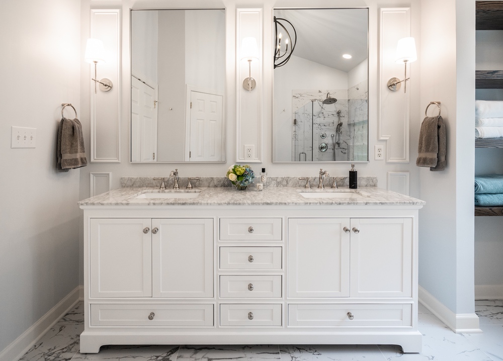
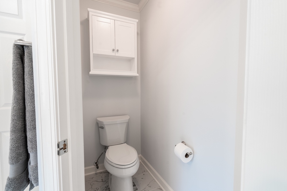
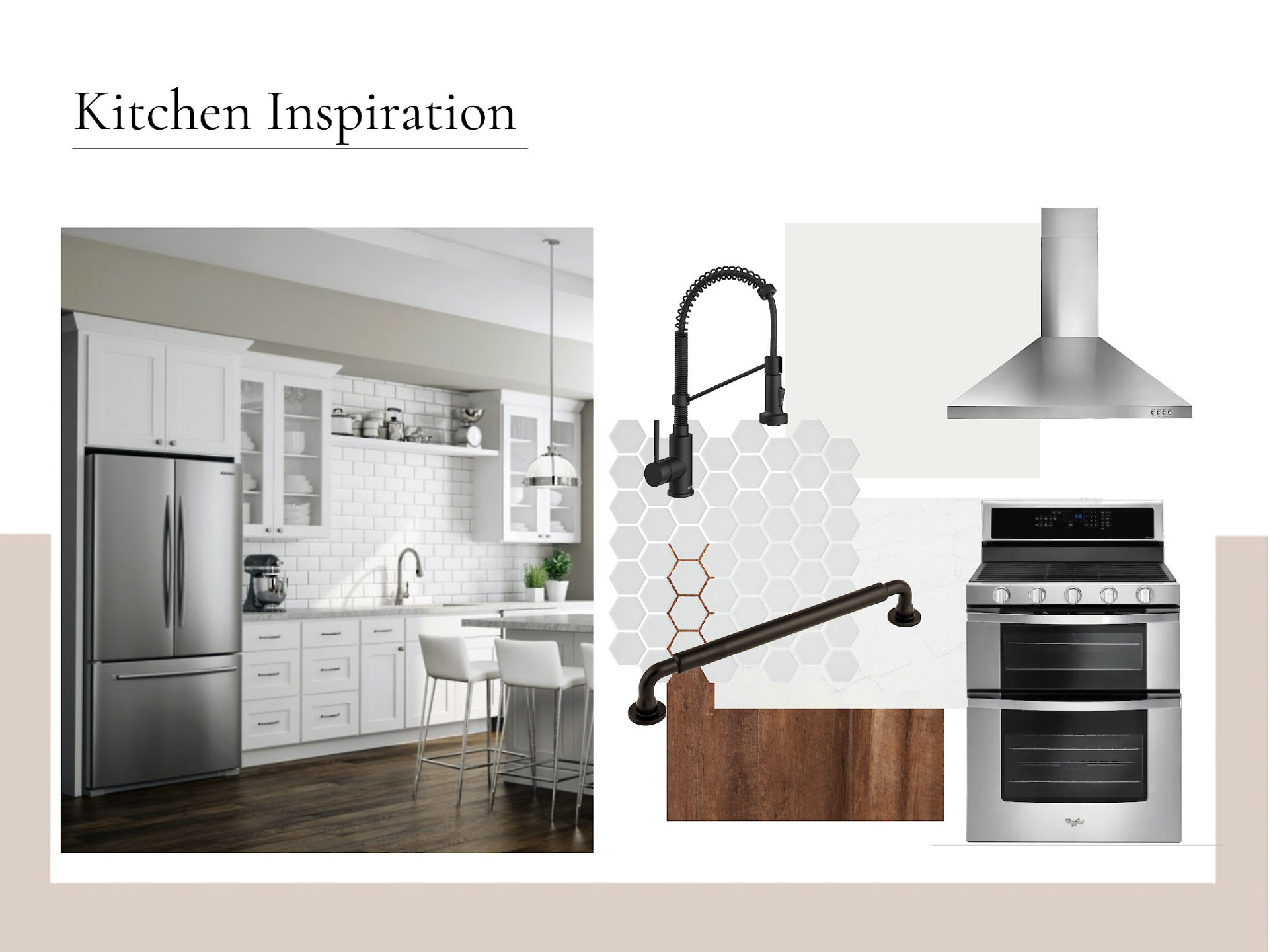
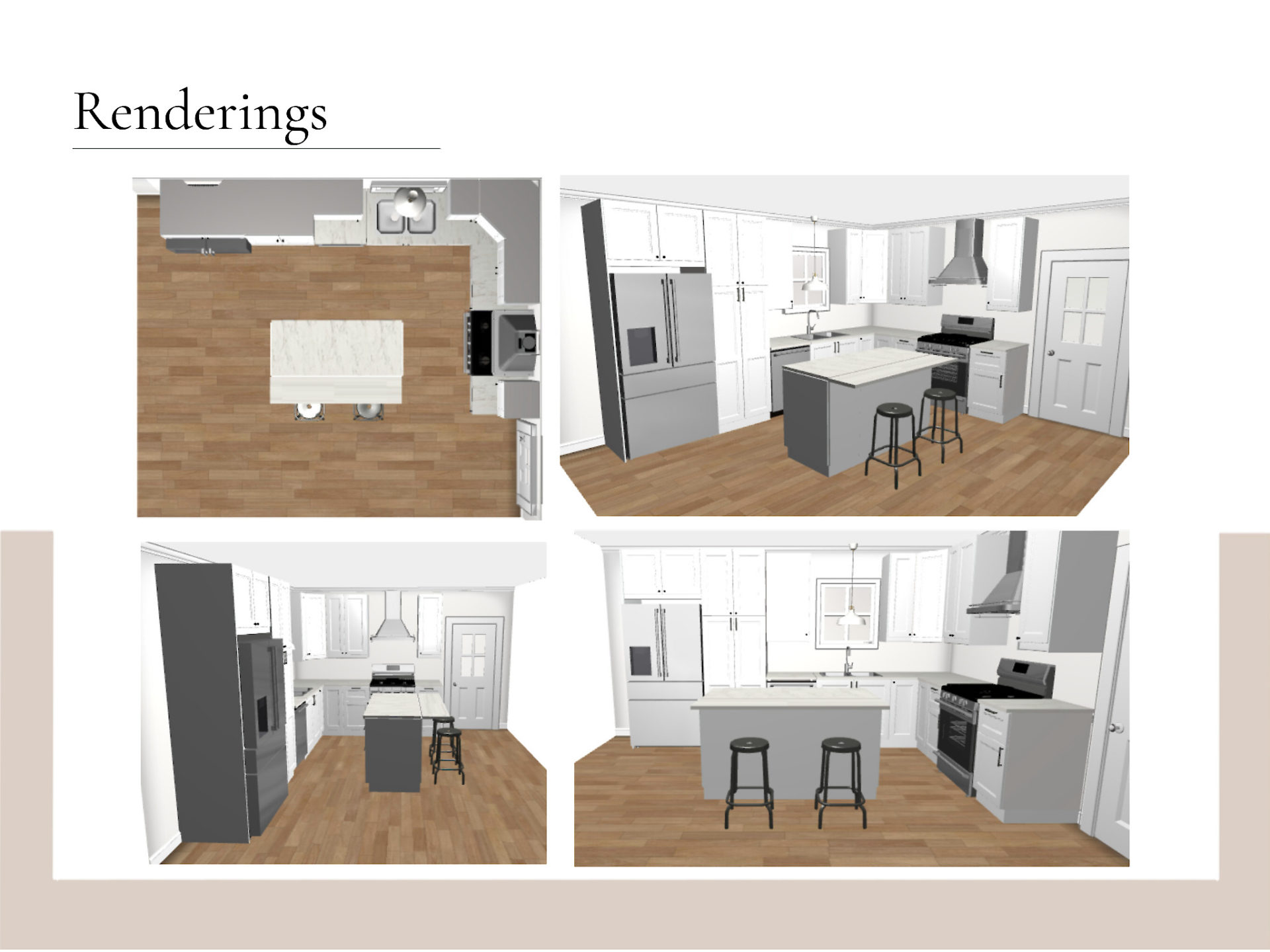
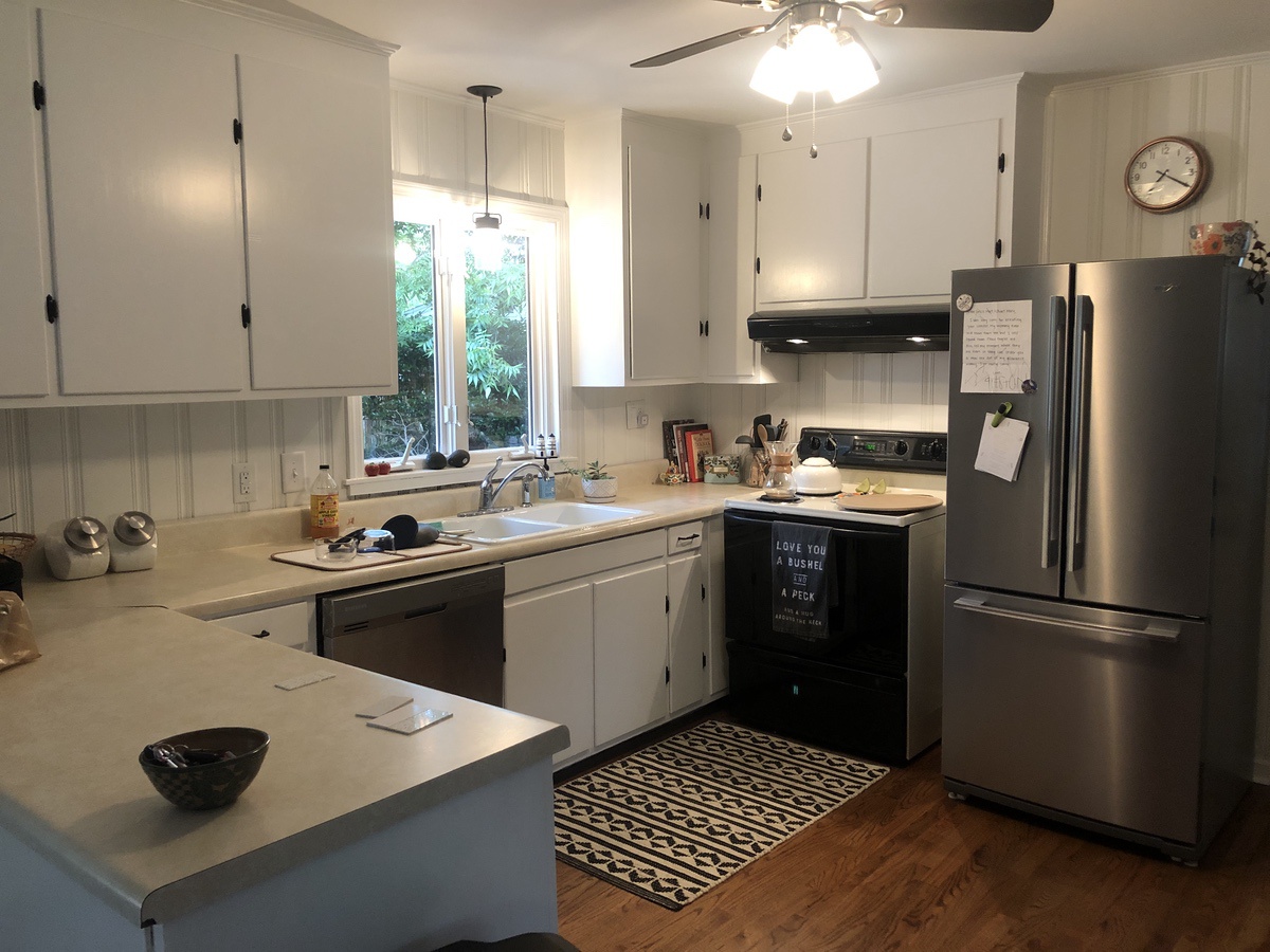
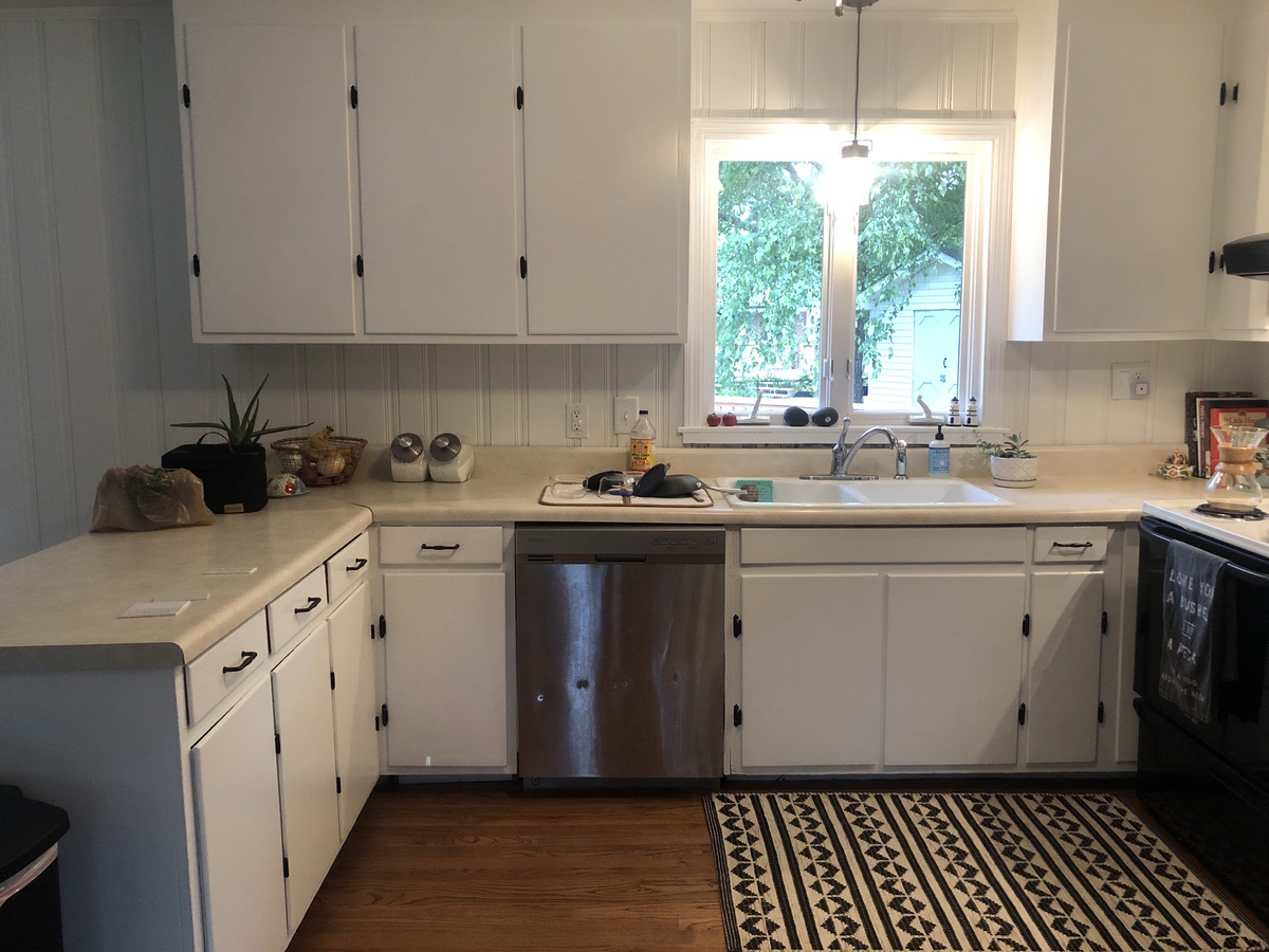
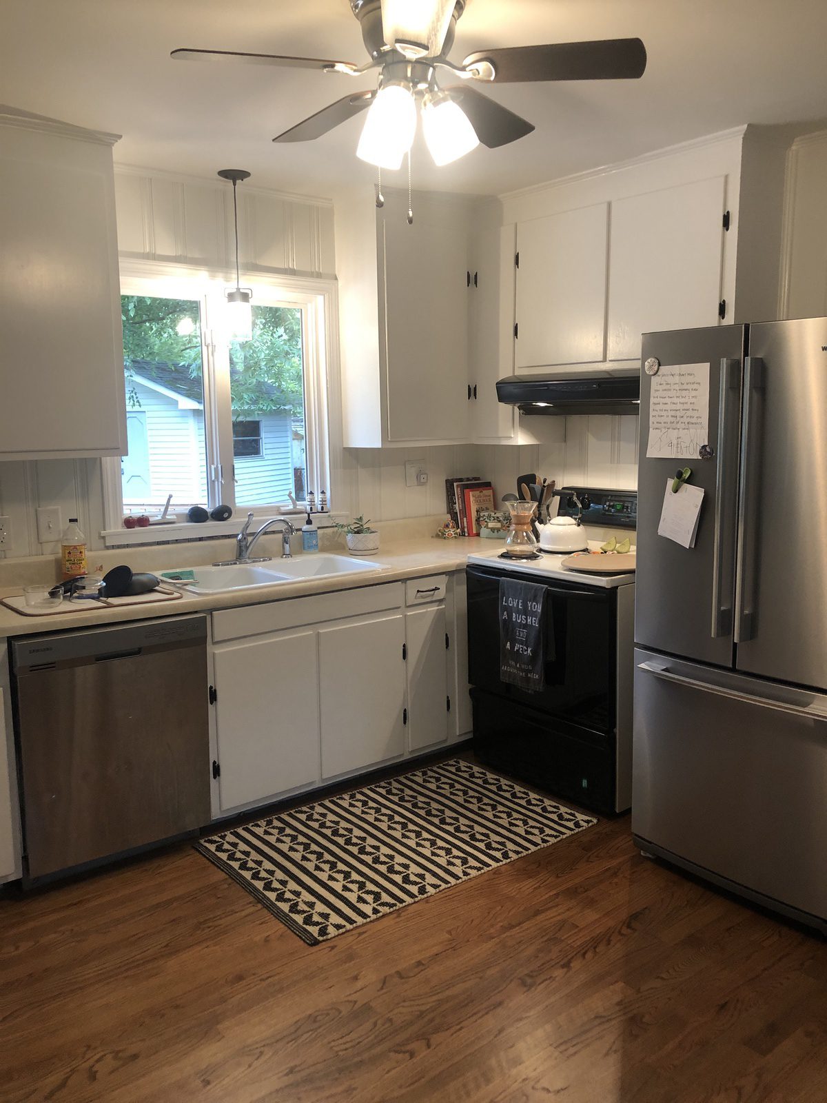
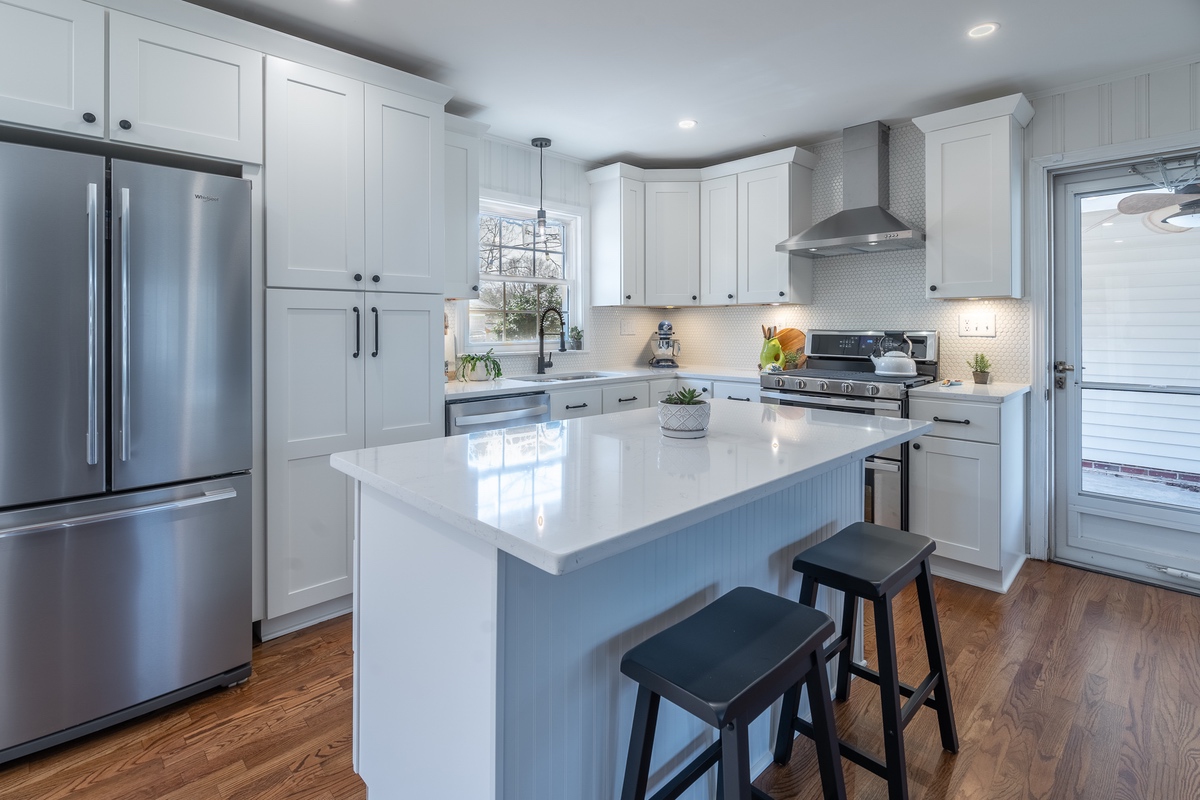
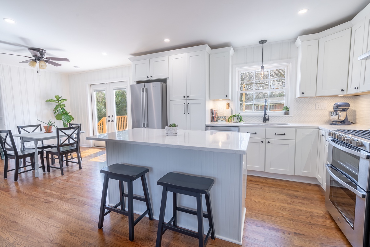
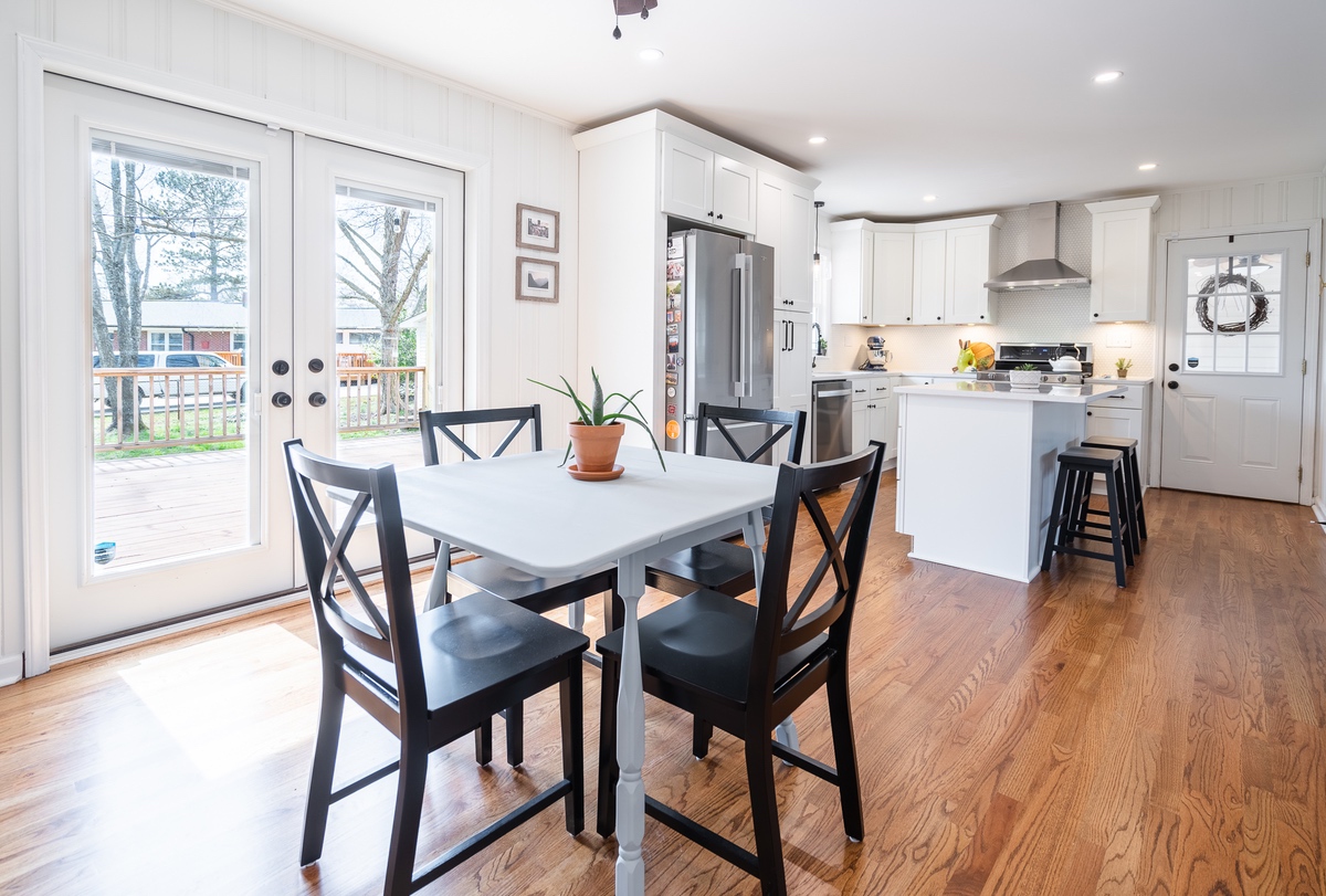
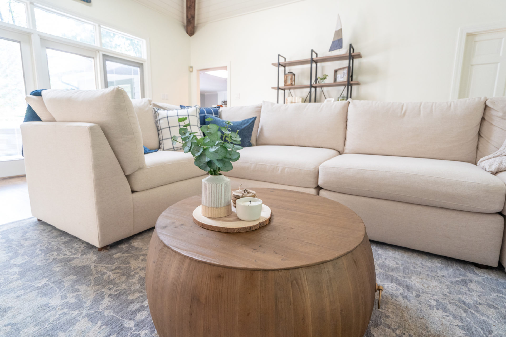
Not sure what to prioritize when it comes to updating your home before you sell? We can help! Check out this inspiration for recommended updates we put together for one of our clients.
- Lighting: When it comes to lighting, don’t rely on a single ceiling fixture centered in the room. Consider additional lighting, like wall sconces or lamps, to add depth and dimension to a space. You might also want to switch out your standard, builder-grade light fixtures for pieces with a bit more character. A contemporary chandelier can add a lot of visual interest!
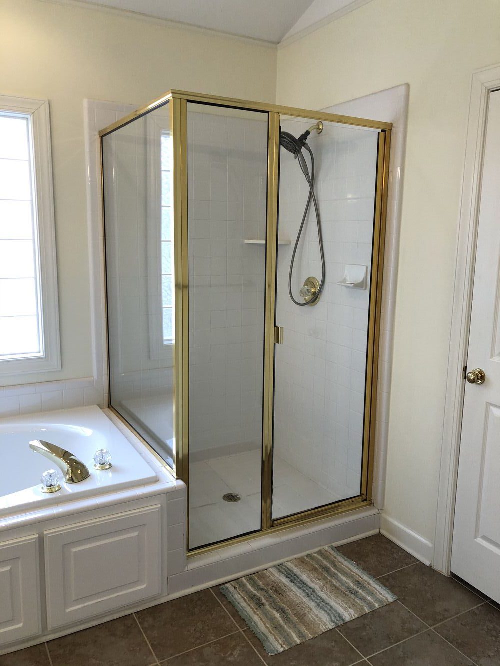
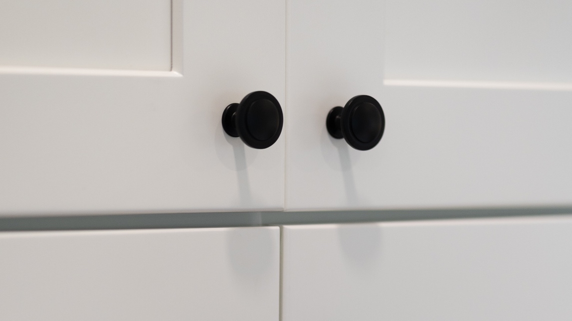
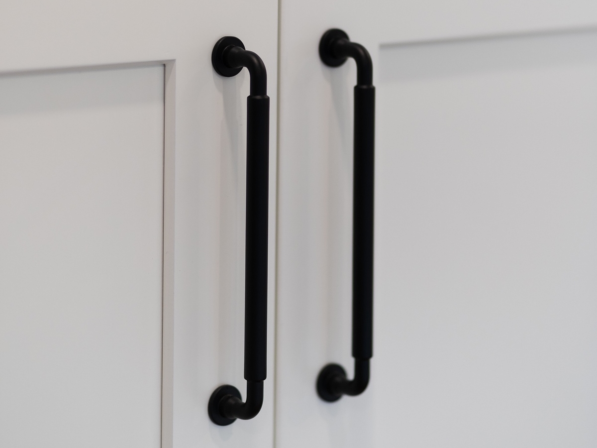
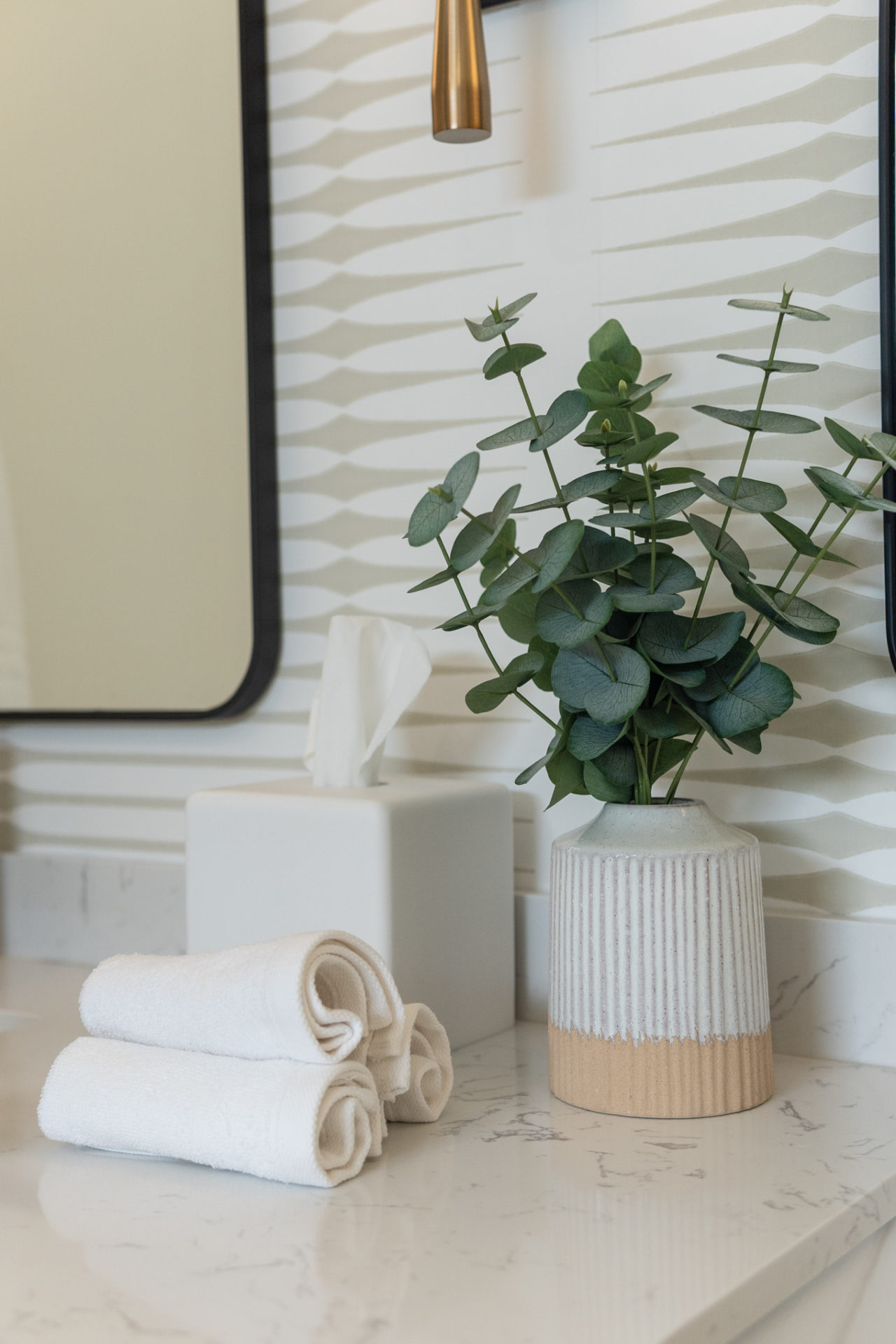
- Hardware: If you don’t have the time or money to remodel your kitchen or your bathroom, updating the hardware and plumbing fixtures can go a long way. Replace outdated faucets, knobs, hooks, and other small hardware with more contemporary options to give your home an instant facelift.
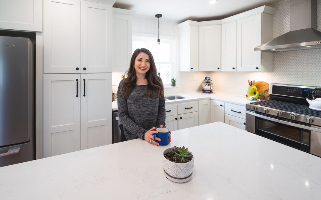
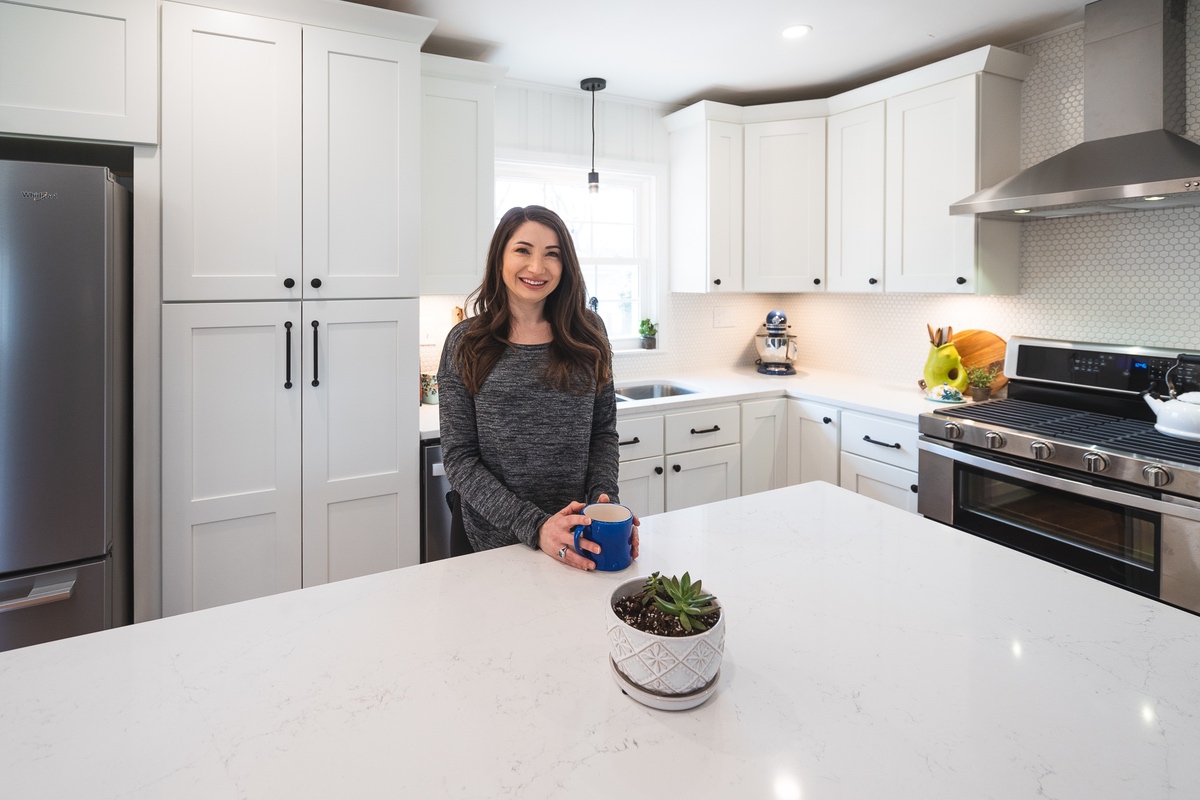
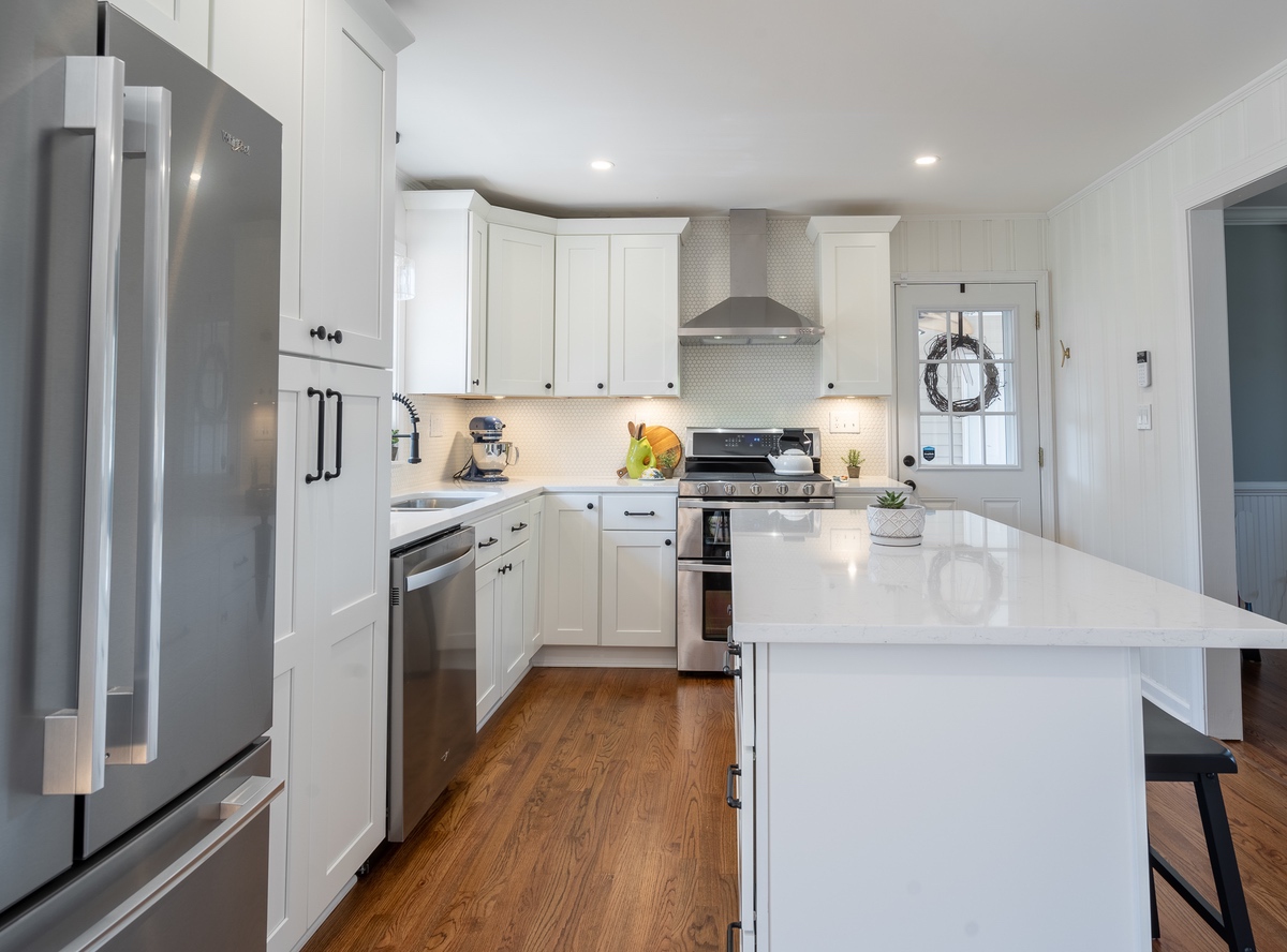
- Cabinets and Countertops: If you have a little more wiggle room in your budget and your bathroom and kitchen are in desperate need of a refresh, update the cabinets and countertops along with the hardware, and consider switching out your bathroom vanity.
Stage
We love personal touches, but when you’re trying to sell your house, it’s best to depersonalize as much as possible. Potential buyers should be able to imagine themselves living in the space. Here are a few ways you can help people envision their lives in your home:
- Rearrange your furniture. Try to stage your furniture in the best way to maximize the space, and remove any furniture that is too large.
- Declutter your space. Remove extra knick-knacks and personal photos, and focus on staging your walls and surfaces with neutral decor, art, and greenery.
- Set the dining table. Even if you don’t eat at the dining table much, set it for a full meal so potential buyers can imagine themselves eating there.
Before you list, try some of these simple solutions and small updates to give your home the refresh it needs to attract buyers. And, if you need inspiration – we can help!

